WEBSHOPS – LIMITED EDITION PRINTS & ARTIST MERCHANDISE

Here you will find the official webshops of artist Arjan van Gent.
In collaboration with befriended musicians, graphic designers and specialized printers, my portraits have been translated into high-quality limited edition giclée prints and exclusive artistic merchandise.
These webshops are an extension of my studio: not mass production, but carefully developed editions in which quality, craftsmanship and presentation are central.
From iconic portraits from the Wall of Fame to special collaborations around, among others, David Bowie and Mick Ronson — each product is rooted in my original work.
Take a preliminary look at the webshops about Mick Ronson ,The D.A.M.Trilogy, David Bowie
Merchandise
In addition to fine art prints, selected designs are available as:
• T-shirts
• Bags
• Specials in collaboration with musicians
These designs have been carefully selected and directly relate to my original portraits.


Ava Cherry, David Bowie’s longtime collaborator, signing a limited edition piece during our collaboration.
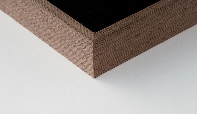
Limited edition giclée prints
My giclée prints are produced in collaboration with Studio Buitenhof in The Hague, a specialist in high-quality fine art reproductions.
The prints:
• are printed with Epson UltraChrome HDR inks
• are lightfast and museum quality
• are usually issued in a limited edition of 25
• are supplied with a certificate of authenticity
• are personally numbered and signed
These are not posters, but collectible fine art prints — comparable to exclusive prints, translated into a contemporary technique.


FRAMING AND GLASS ADVICE